Every year trends change and evolve. Every design element comes together to create, tell stories, and elicit emotions. Type is no different. It helps express our ideas visually and well, literally. We can't get over the creativity and imagination that goes into developing new fonts and how these come together in a design to present products in new and exciting ways.
With that, we give you seven significant font trends we see rising in popularity. These trends are varied and phenomenal, from curvy and thicc to classically artistic or photorealistic and tactile.
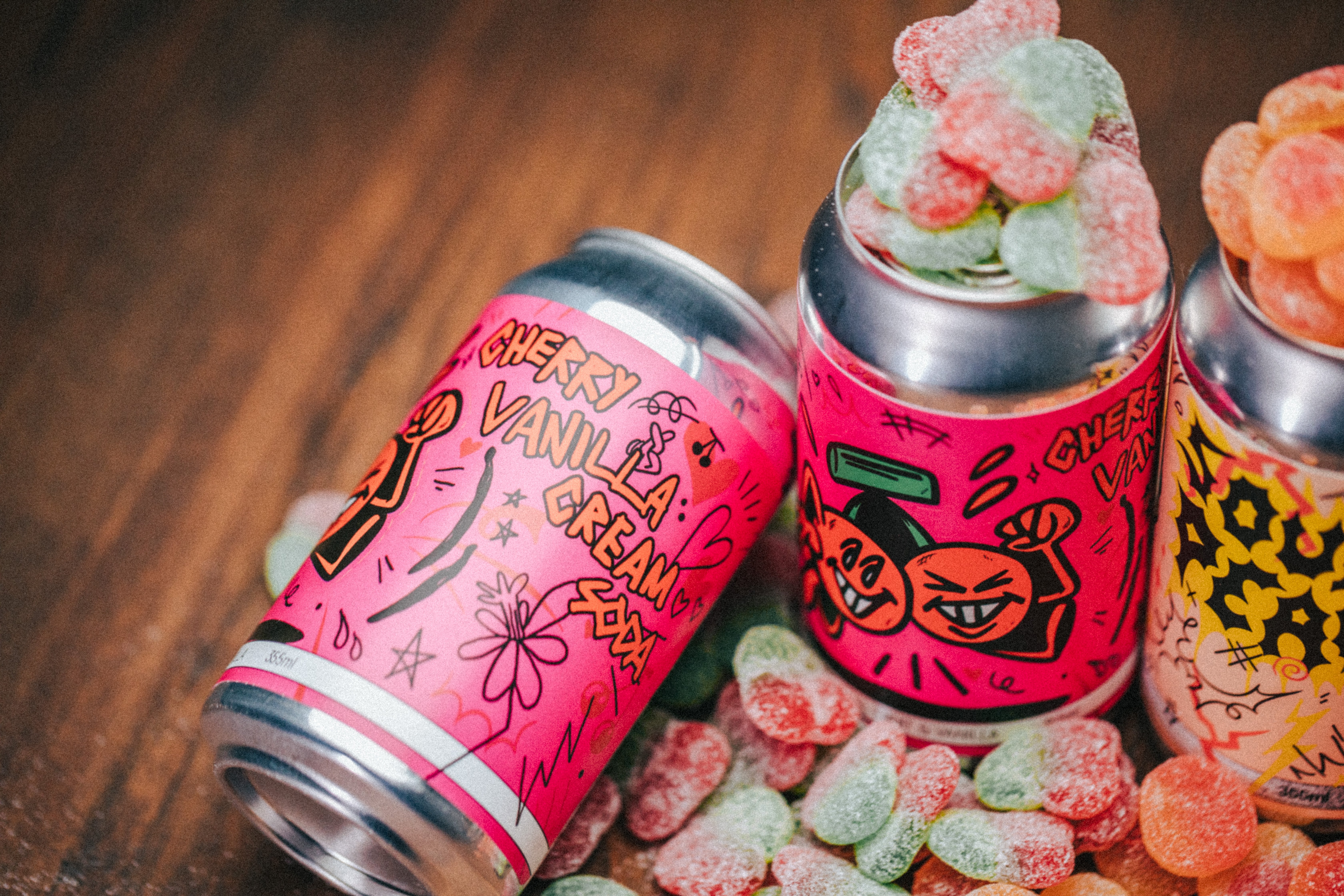
Super thick strokes
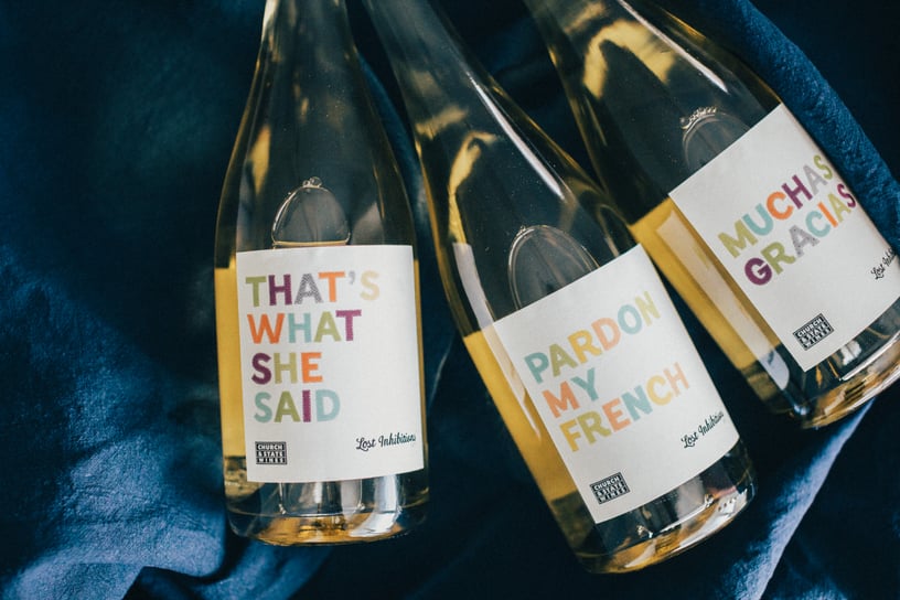
Bold, thick, and chunky. These fonts are here to slay. Blending the line between negative space and font, this trend is all about crafting unique shapes and making a statement that is at once impactful and surprisingly approachable.
Church and State wines speak for themselves. Using broad, wide lettering styles and heavy contrast, their labels can be read as both Avante-Garde and attainable due to the implied levity of the font.
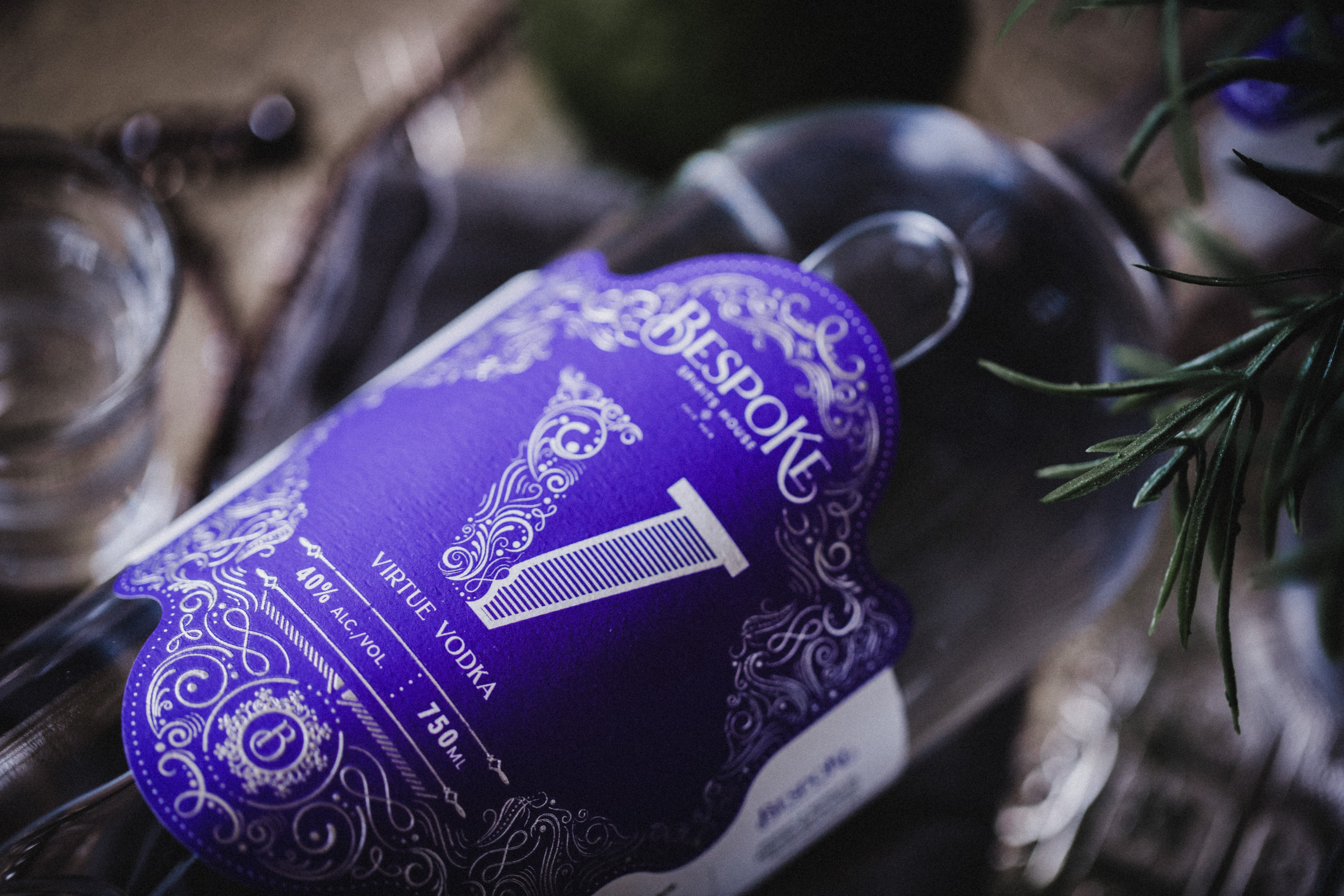
Arts and crafts revival
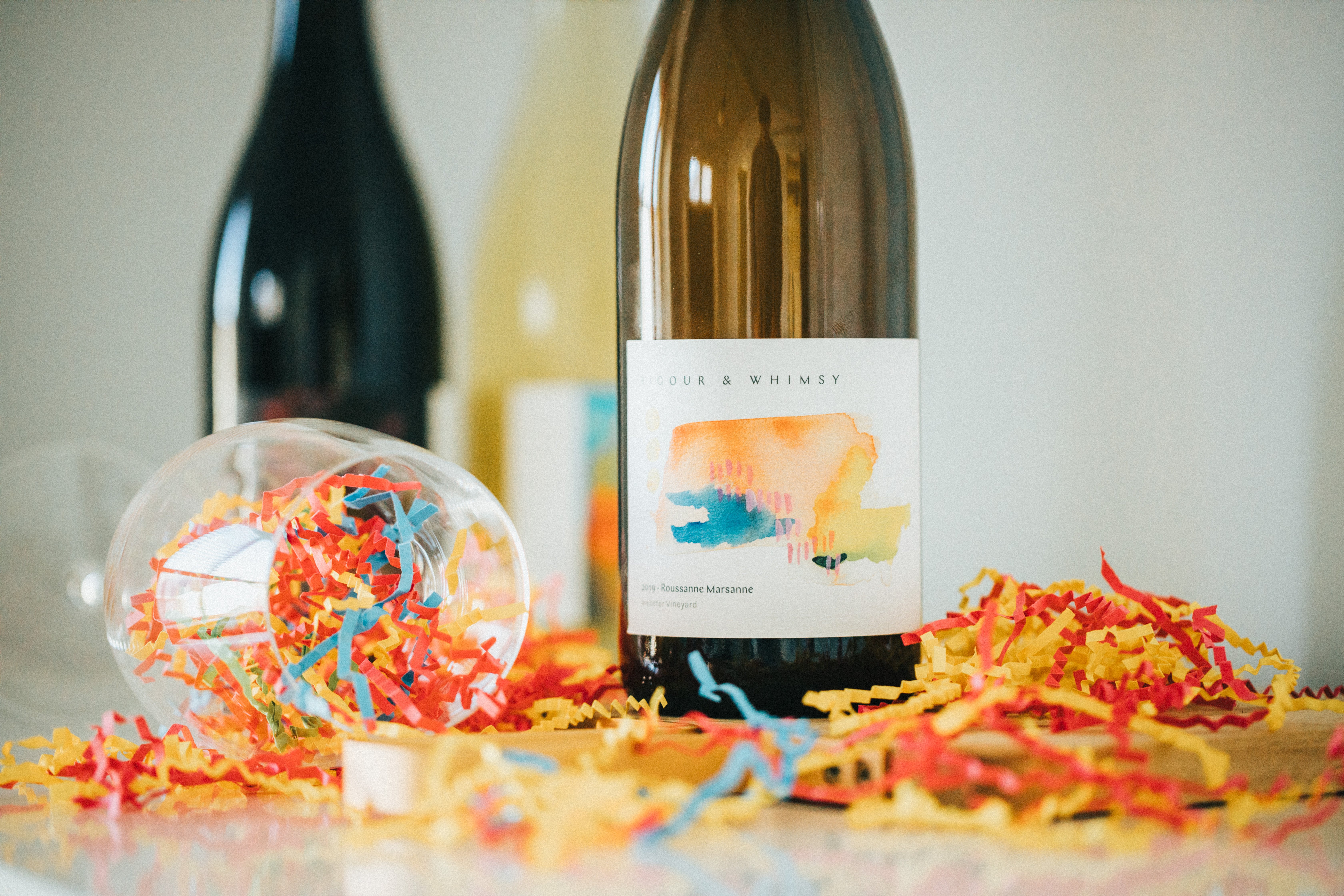
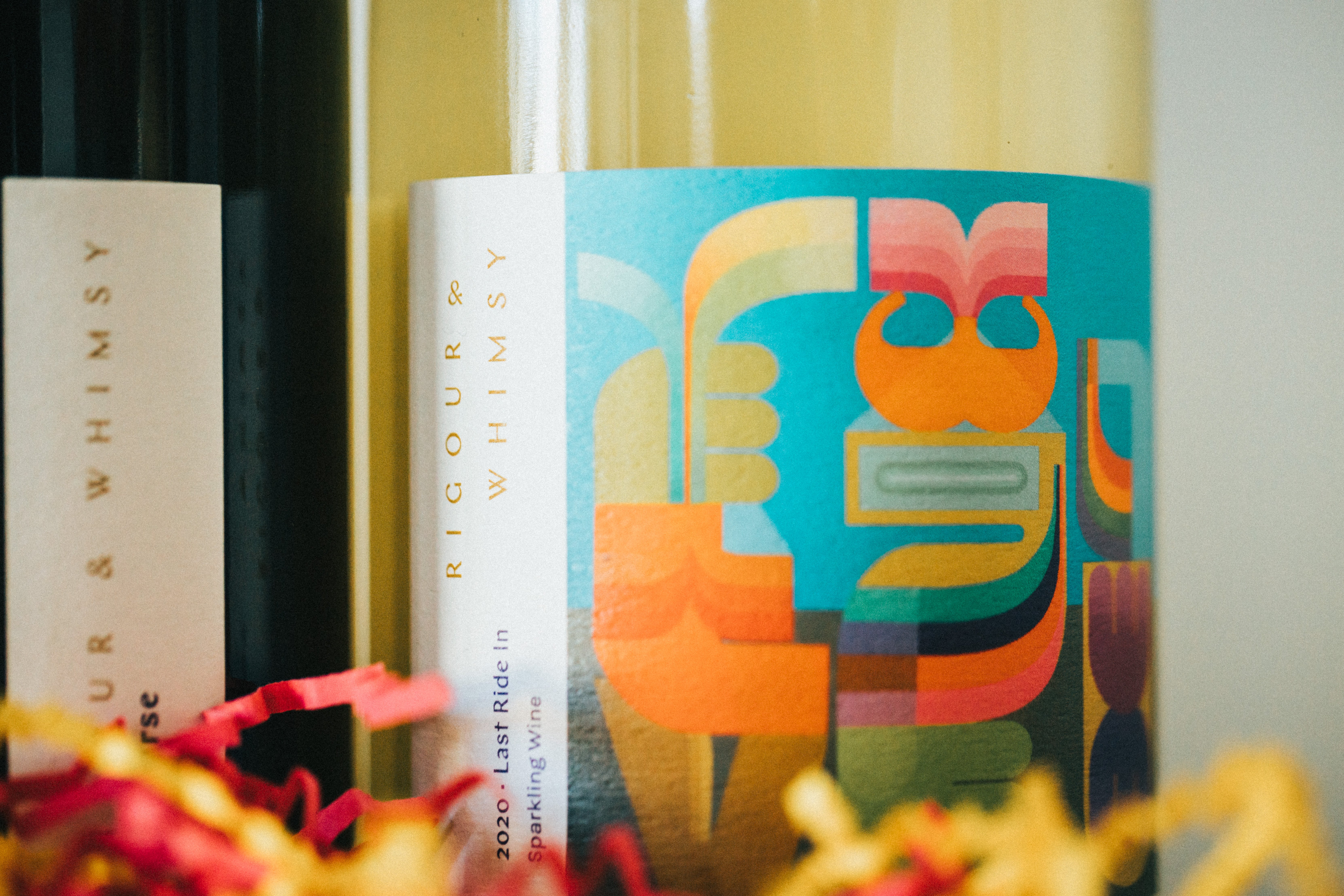
This font theme stemmed from 18th-century hand-decorated lettering and precursor to Art Nouveau. It screams uniqueness while returning to classical artistic techniques with its illustrative individual lettering.
This trend was, and is again, about rejecting the standardized art and mechanical design process. It's about finding new ways to express yourself using contrasting, decorative strokes and crossbars.
We can't think of a better example than Rigour & Whimsy. A brand dedicated to finding balance and harmony through contrast, these artful labels take on the contrary attitudes of design that are complementary and interdependent to create something harmonious and unique.
Authentic handwriting
Handwriting is arguably the most personal and human of fonts. Each person has their own unique style and handling of each shape. We expect to see an increase in that scrawling, messy writing with this trend. It goes beyond bringing sophistication or impact to a brand's design, instead imbuing it with a sense of humanity and connectivity.
For added authenticity, variable content software allows users to create their own fonts based solely on their handwriting. Mimicking their own personality and uniquely human touch. Aside from lending an alternative or grunge aesthetic to brand labels, these messy scribbles bring the realism for an emotional connection with the end-user.
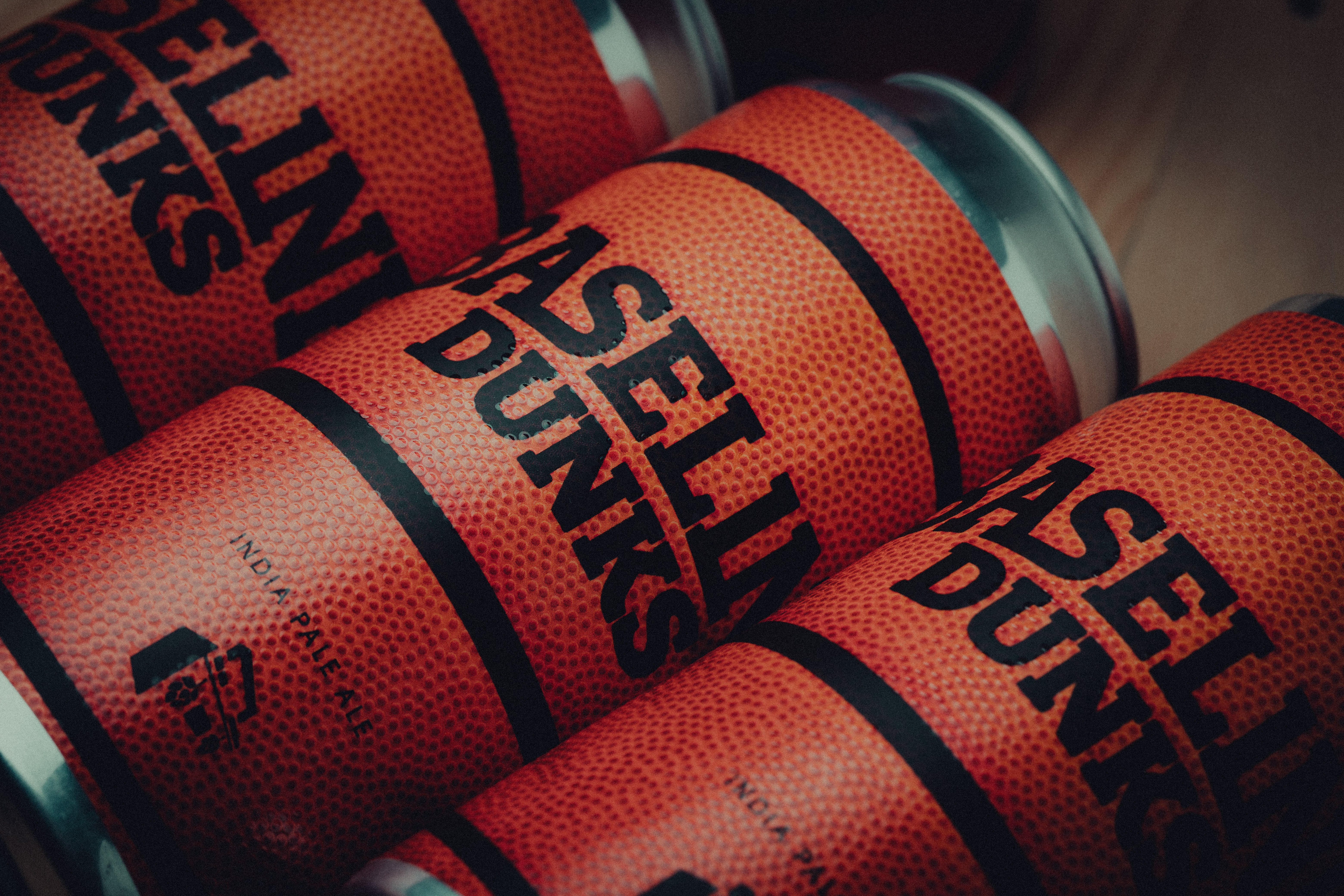
Rounded fonts
Rounded fonts aren't just for kids anymore. Far from being immature, these funky rounded fonts are playful and animated. Paired with brilliant colours and stretched-out energy, these typefaces become dynamic and fun.
For the right brand, like Dandy Pop, pairing these incredibly rounded fonts with caricatures and vibrant colours becomes unapologetically weird. It takes on the playfulness of youth while turning it on its head for adult audiences. Those blobby, irregular forms create appeal for the offbeat tastemakers.
Experimental type
It's been a, yes, we're going to say it, unprecedented time. While many design trends lean towards order and calming tones, there are also those, like experimental type, which is all about dismissing order and going with the flow! This is about designing free-flowing and exciting shapes that use space differently, add serious visual interest, and challenge end-users to think differently.
Tactile realism
This year expect increased realism and objects within fonts. Design is about storytelling, not just what's been written but how it's written. This trend takes typography away from the digital world and into the physical.
The result? Letters that feel photorealistic and honest; imbued literally with the subject matter. So we're thinking, why not take it a step further and incorporate textures? Create a tactile font using high build, emboss, or spot UV; it's all possible. Taking that final step to create something tangible.
Retro curves
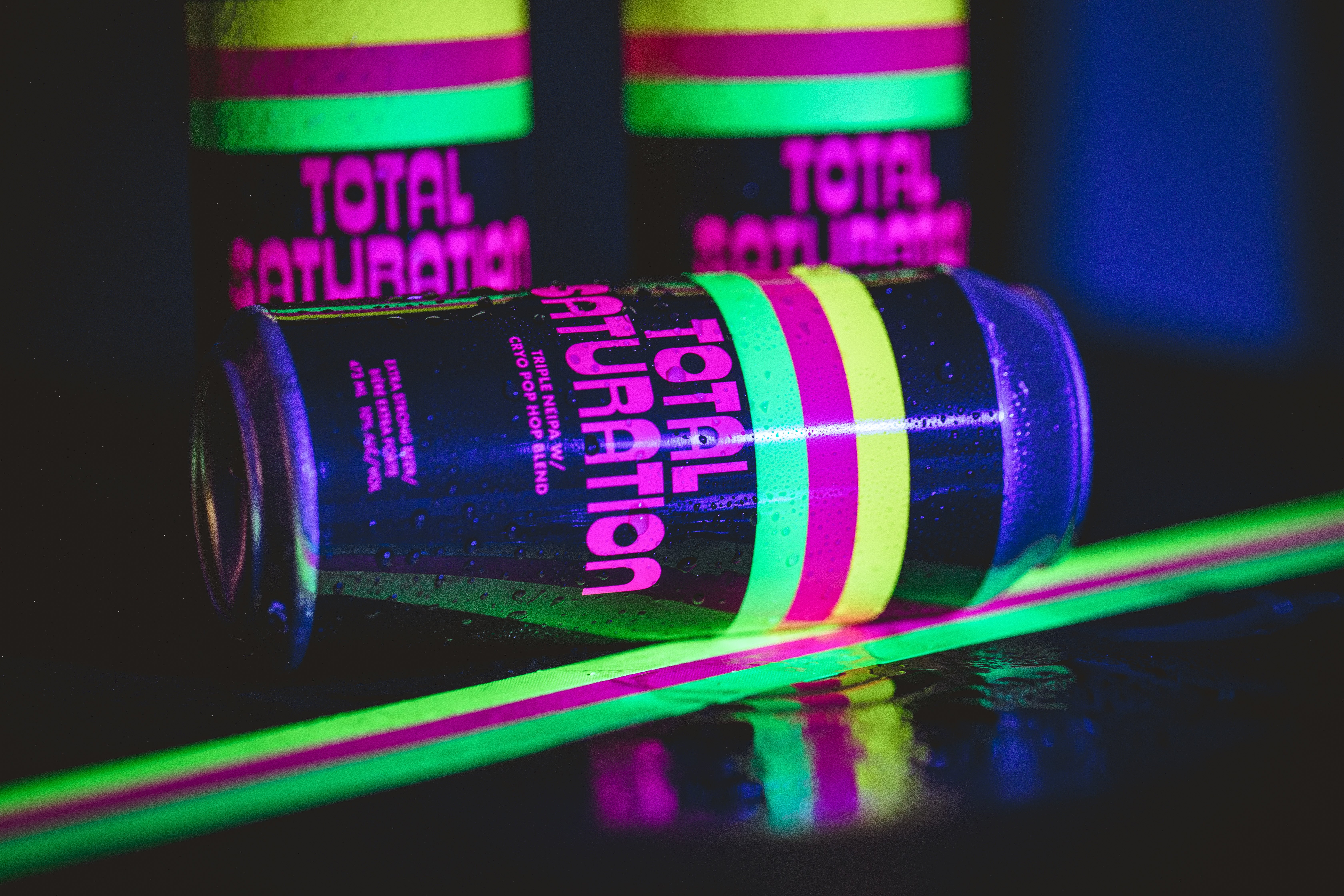
Throwback! This year is heading back in time with thicc and juicy 70s fonts. These evoke jukeboxes, vinyl and bell-bottom jeans (another favourite returning trend this year!). Groovy movement and funky lines are natural within this typeface. It's cheerful and alive; bring it to a whole other level with neon colours (and fluorescent inks!) to create even more fun and retro vibes.
This is by no means the be-all-end-all of the design trends (or even font trends!). If there's one thing we know for sure, working day in and out with creatives, it's that big ideas, and new ways of playing with design elements are on the rise.
What do you think? Did we miss any big trends you're seeing? Is there something out there inspiring you right now?
Let us know at @summitlabels or

\
Follow Us