Narrowing down fonts and selecting the right one for your brand is no easy feat! considering how it will look digitally printed on your labels only adds to the task. So, to help you tackle the world of fonts (specific to labels and print), we’ve created this handy guide with a list of the best and worst fonts.
We hope this sparks some inspiration and provides a better look into stuff you should keep in mind when selecting fonts for your next label. Here’s a handy cheat sheet. We’ve listed a few examples of better fonts to use, and those that you might want to steer clear of!
Best Fonts:
- Helvetica
- Century Gothic
- Open Sans
Worst Fonts:
- Comic Sans
- Roc Grotesk
- Armada
- Balboa Plus
At the end of the day, it’s important the font aligns with your branding, but will also stay clear, readable, and of good quality in print format (and after application). So, let’s break it down further and examine common characteristics that make a “good” or “bad” font for digital label printing
The best fonts carry some similar characteristics. Check it out:
Bold Fonts
Bold fonts are thiccc (yeah, you read that right. With three c’s). As a result, they are also heavier in weight, easier to read (especially at a distance), and eye-catching. Bold fonts are often chosen for headlines, logos, and posters where you’re looking to capture the audience’s attention and direct their gaze to a specific sentence, word, or section.
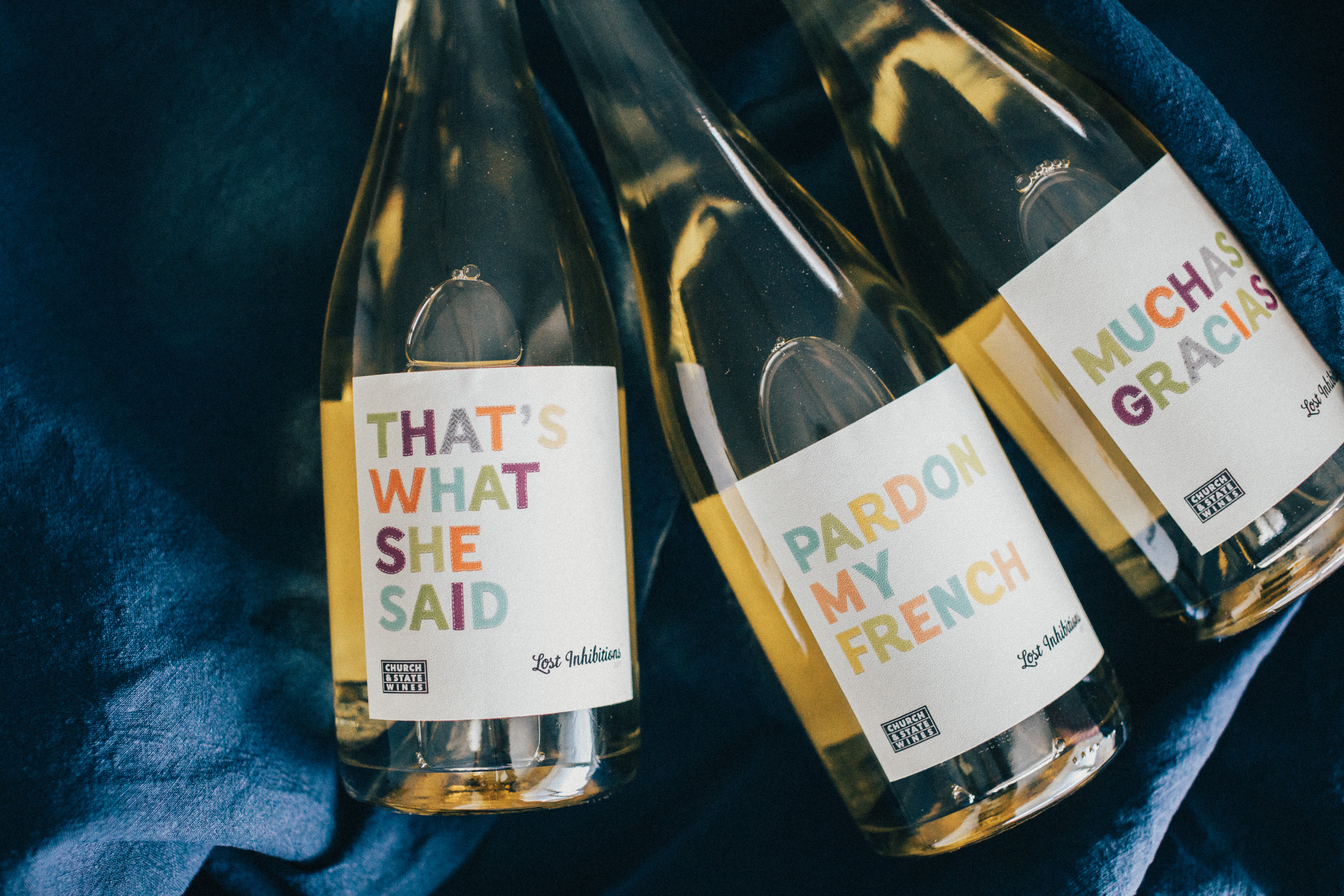
Sans Serif Fonts
These are multifaceted fonts and great for printing due to the clean lines and simplicity often associated with them. Conversely, serif fonts are more difficult to replicate. We will admit they’re beautiful and usually have a certain elegant and decorative flair that sans serif fonts simply don’t possess. Still, it can be quite challenging to replicate (especially with embossing, debossing, or foil stamping). Luckily, we have some pretty rockin’ capabilities being a digital printer. So, while they are a trickier font style, we’re open to working with you to see your label and font dreams to fruition (whether it’s serif or sans serif).
**We just recommend keeping these things in mind when planning, designing, and ordering your label! **
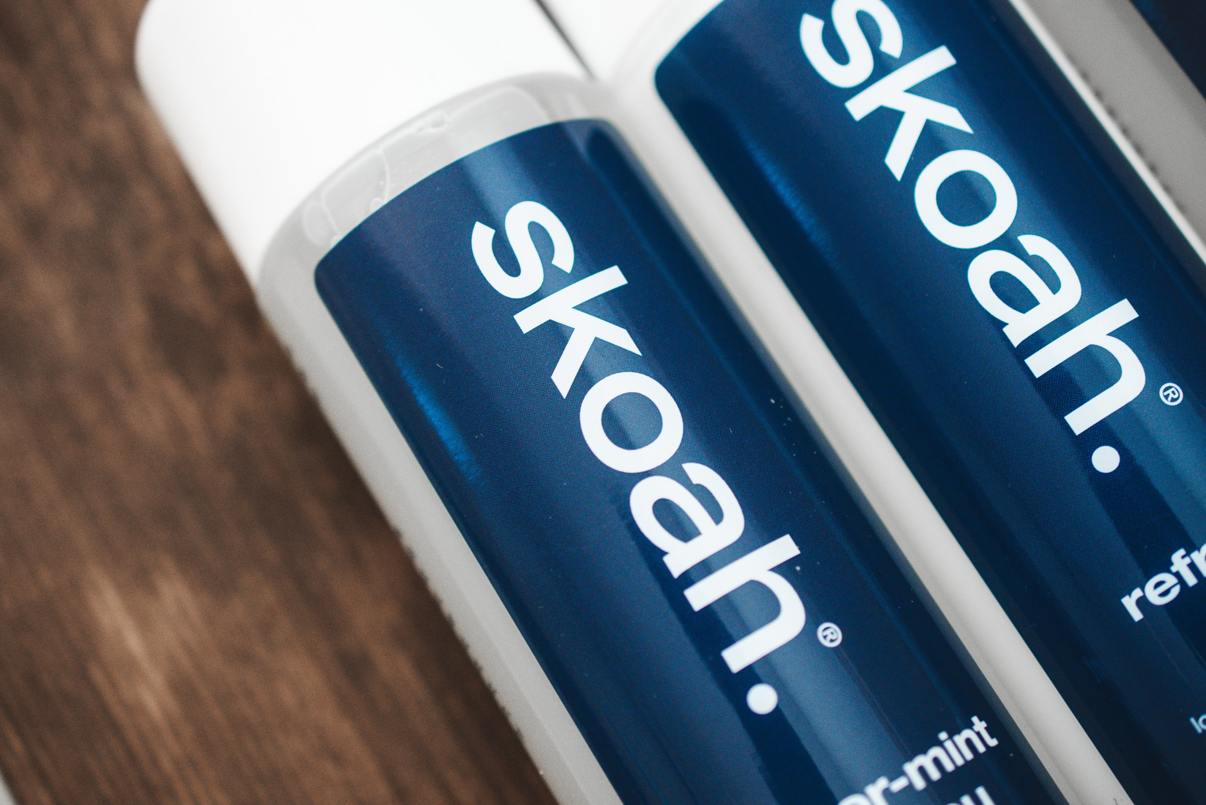
The worst fonts have one main thing in common, and this is the weight of the font.
Now, it’s not the end of the world if you pick a thin font or fall in love with one that falls on the thinner side. However, it’s important to note that they typically perform better with a regular print job, free of embellishments. This is because the thin, fine lines associated with these fonts are difficult to foil stamp and emboss. Why? Because it’s hard to replicate fonts with such fine detail.
Additional considerations
It’s also important to note that selecting the right font for the job will vary on a case by case basis, and the following are all elements that should be carefully accounted for:
- Colour (contrast, contrast, contrast)
- Size
- Material
A font's print performance will depend on these three factors as they all play an important role in the label printing process. So, if there’s one thing you walk away with, please remember that these are the important elements that affect the print quality and how the overall written content prints. Digital is great for fine detail and does allow for more flexibility than with flexographic printing, but all within limits, folks!
Fly free with your newfound font knowledge and get creative with those labels. We can’t wait to see more crazy designs with cool and unique fonts, but please keep in mind the tips and tricks outlined above so that your labels print correctly, and If you’re wondering about a specific font or typography; curious about how well it will print according to your label specifications (and artwork), reach out and let us help. We’re the experts, after all ;)

Follow Us