Serious question: is your product grammable? Does it fit the Instagram-worthy category? Social media has become a huge part of the digital age, and we can all admit we spend a little too much time on Instagram, Facebook, and the like. So, as a business, use this to your advantage by creating products consumers can’t help but post. What better way to capture their attention than with wonderfully awesome (Instagram-worthy) labels?!
Let's look into what makes a label shareable and how to jazz yours up for social media.
Incorporate Hashtags, Contests, and Challenges into your Packaging
You can not only amp up your product's shareability through the design but also by bringing challenges, contests, and hashtags into the mix. All of the things that prompt consumers to post pictures of the product! This is a great way to get more shares on social platforms and a smart marketing strategy often used to increase brands' social presence.
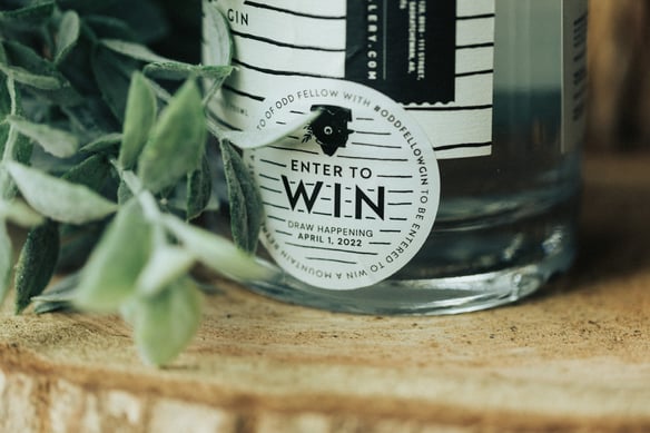
One company that nailed this on the head is Fort Distillery, with their latest Odd Fellow Gin. They joined forces with Banff Springs to give away a deluxe relaxing mountain retreat, and included an “ENTER TO WIN” sticker label prompting people to participate in the contest by sharing pictures of the bottle.
Y2K Aesthetic
If you're a 90's or early 2000's kid, let the nostalgia sink in as the Y2K aesthetic makes a comeback. Our creative director did a deep dive into this year's packaging and design trends, and Y2K came up more than once. So, we think it's safe to say anything in this vein will generate some buzz on social and evoke a sense of sentimentality.
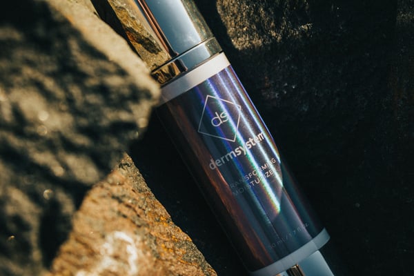
A personal Summit fav that captures the Y2K aesthetic excellently is Dermsystem, with their beautiful, oh so shiny transforming moisturizer, printed on our Rainbow Holographic stock.
Big Bold Fonts
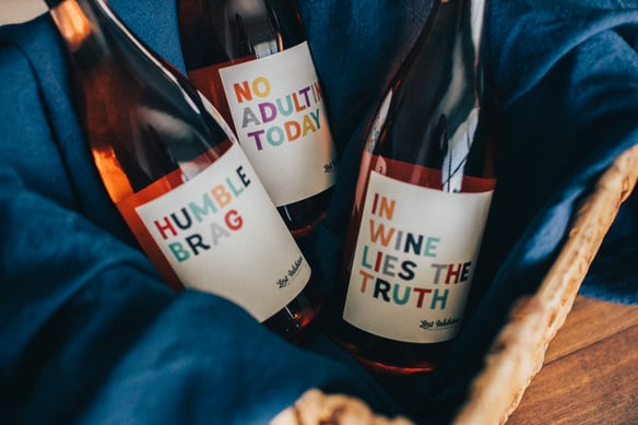
While we’re on the topic of aesthetics, minimalism is on the rise. Jump on this design trend by keeping your visuals clean and simple, just like Church and State does with their beautiful Lost Inhibition series wine labels! The clean beige like background is with the bold bright font which is easily readable from far away and pleasing to the eye. I mean, look at it. No fluff, but still fun!
Interactivity, Going Digital and Elevating the Consumer Experience
As we've mentioned before in our many blogs, interactivity is key, and consumers gravitate towards brands that provide experiences. To capture this in your labels, consider adding QR codes, allowing you to expand your branding past just the tangible product and elevate the consumer experience (essentially, taking it to the next level). Sounds fancy, we know… but it is oh so doable.
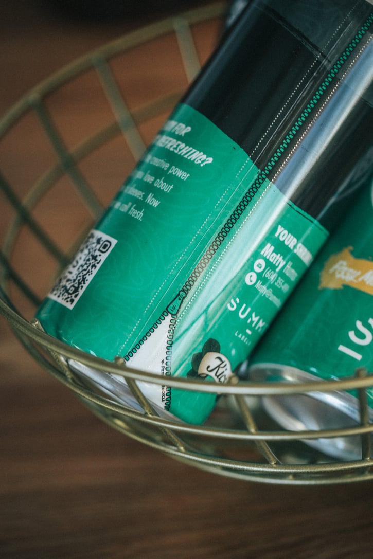
See it in action for yourself with our Kics Lemonade collaboration. One of our wonderful Summit team members designed the shrink sleeve label, which sports a handy QR code on the bottom right side of the can, directing consumers to a landing page with additional information on Shrink Sleeves and their rockin’ capabilities.
We hope these ideas sparked some inspiration and got your creative juices flowing. The social landscape is HUGE, and trends are constantly changing. So, if you want to stay up to date on the latest happenings in the packaging and design space, we recommend you sign-up for our design newsletter and let the information come straight to your inbox.
As always, we want to hear what you think! If we missed a hoppin' trend, or you just want to talk about the return of Y2K, drop us a line, or shoot us a DM on Instagram @summitlabels.
Follow Us