Neon is having a moment. Tacky and beautiful, it is making an explosive and artistic comeback in pop culture.
"Once neon symbolised vulgarity, sleaze, Las Vegas," Jonathan Jones wrote in The Guardian "Now it symbolizes art."
You can catch these ultra-bright colours in Arcade fire’s new album cover, or in R&B music videos ala LMK by Kelela. Much like ‘millennial pink’ neon is making a resurgence in today’s design scene, mostly due to a nostalgic connection to the 1980s (Stranger Things or GLOW anyone?).

Neon colours can add hype, and are fantastic for compelling actions and attracting eyeballs. (They’ve been used extensively for bright ‘buy now’ buttons on sites and apps for a reason!). The best thing about neons and fluorescents? The tie-ins to social media. Much like the “infinity mirror room,” neon and LED installations and artworks present perfect photo-ops for Instagrammers. That’s an easy way for gallery and festival curators and now, with fluorescent inks, for consumer goods to maximize their online presence. So how do you take full advantage of this trend in your latest print design? Let’s dive into it!
Fluorescent Colour Theory
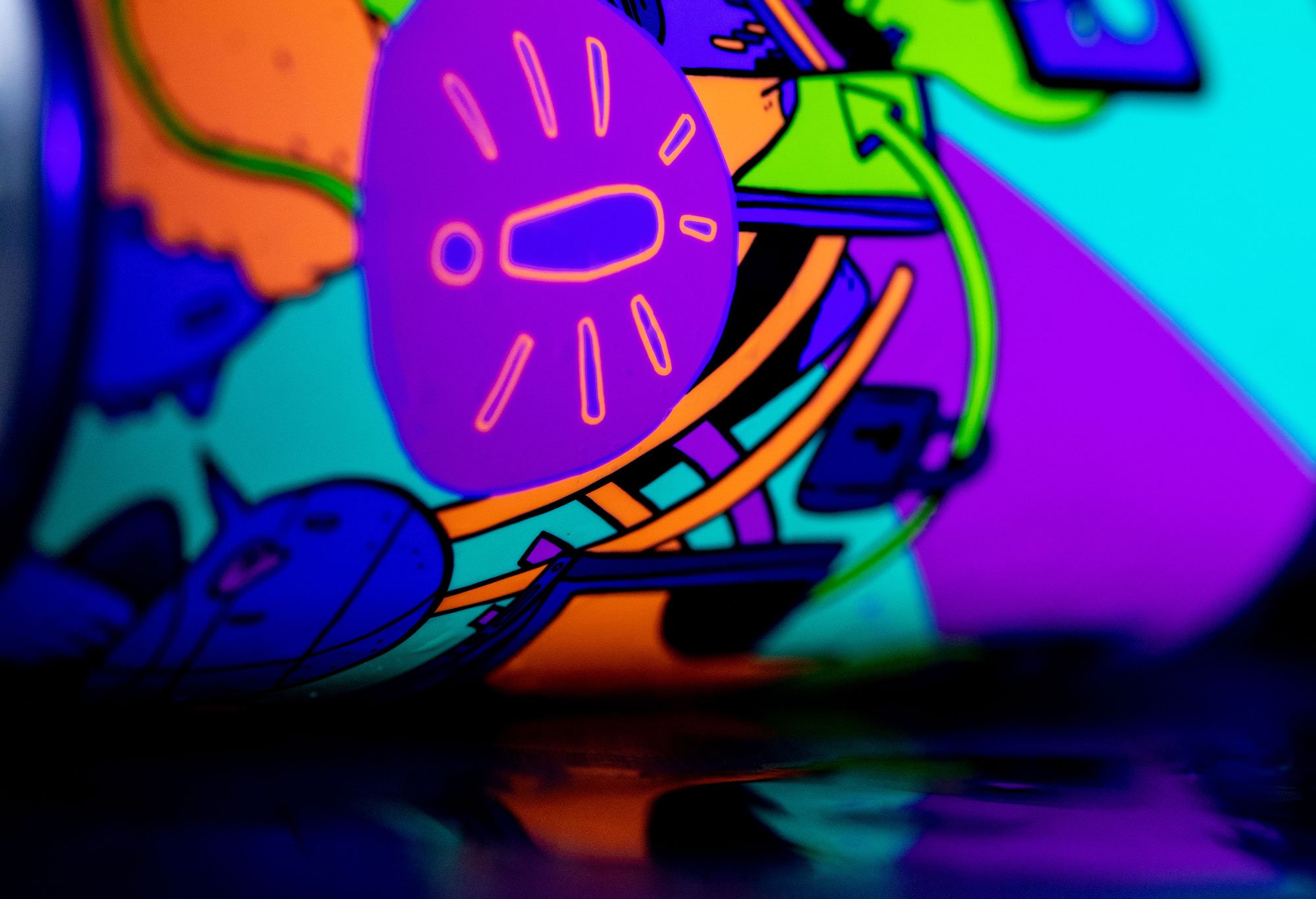
First, understand fluorescent colours stand apart from other colour types since they literally emit light, making them luminescent. The pigments in fluorescent inks work by absorbing ultraviolet energy (invisible to the human eye) and transmitting it as longer waves in the visible spectrum. That means they require specialty pigment to get the real deal ultra-bright UV vibe. (Read more about the history of fluorescents and the science behind our beta test here).

Print designs can seriously pop if they incorporate neon hues. For example, the Women’s Foundation 25th Anniversary designers Morgan Stephens and Design Ranch used fluorescent accents in their posters, banners, and merchandise. Black-and-white photography and a neutral palette pop the neon pink, even more, making a bold statement about modern femininity.
Take your cues from fashion and interior design, and use a single pop of neon against neutral grey or beige colours for a seriously chic look. Or channel your inner Marta Gawain at the Katowice Street Art Festival and take a more experimental and eclectic approach to colour. Use a neon-on-neon colour palette to achieve a psychedelic aesthetic and more muted black and white typography to keep things stylish and engaging.

Remember, fluorescent or neon colours are just extremely bright versions of primary and secondary colours, such as green, yellow and pink. So they follow the same colour rules as anything else on the wheel. Neon green looks hot with magenta, and blue looks great with electric orange.
Designing Labels with Fluorescent Inks
Are you feeling the inspiration? Ready to unleash the inks? Keep in mind these top tips when you sit down to prep your art files:
- Fluorescent inks work best on white or light stocks, which act as a reflector base and enhance fluorescence.
- Fluorescent pigments are semi-transparent and have lower colour strength compared to conventional pigments. The best results are achieved through multiple ink passes, which tends to be on the more expensive side.
- Hard lines and contrast can be vital in achieving that glow-up effect.
ARE YOU THINKING ABOUT TAKING THE FLUORESCENT INKS PLUNGE?
Hit up one of our label solutions specialists for some help
navigating this brand-new tech!
Follow Us