If you’re located in Canada (aka. the land of snow, Tim Hortons, and overly polite folks, or so we’ve been told), it’s essential to know that Health Canada has set out some stringent guidelines on what needs to be included on cosmetic labels. We’re here to give you the low down on these requirements and provide some inspiration for your next cosmetic label project. Here are the must-haves:
- Classification of cosmetic product: You must clearly state what kind of cosmetic product it is that you’re selling (i.e. Lip Balm).
- Product identity: What is your product and the given name? This takes the first point a little further. Rather than just the classification of the product, it is the specific type. Essentially, it’s the first requirement in more detail (i.e. Lovely Moistures Lemongrass Lip Balm).
- Product quantity: How much product is in the container? The units can vary (i.e. ml’s, grams, or lbs).
- Manufacturer Information: The need to know is both the name and address of the manufacturer.
- Avoidable hazards and cautions: Let users know the potential dangers associated with your product and how to avoid these situations. It’s a preemptive measure, and these warnings make a big difference.
- Ingredients: Many folks want to know what’s in the products they use, and understandably so. Plus, typically, the more information given, the more transparent and trustworthy brands and companies appear.
Additional Considerations:
- Ingredient Size (font) - make sure it’s legible. No one wants to bring out a microscope just to read what’s on the product. Do your customers a favour by ensuring the font is easily readable.
- Language - ensure that the language is accessible to the average consumer. It’s important your users understand the content on your products. We’re not saying don’t be fun with it. We love quirky language and funny jokes. But, no gibberish please. (This goes for super complex words too, like Brobdingnagian. Just say gigantic for Pete's sake!)
Design tips
Now let's get to the tips! To take your cosmetic label to the next level consider the following:
Minimalism is in

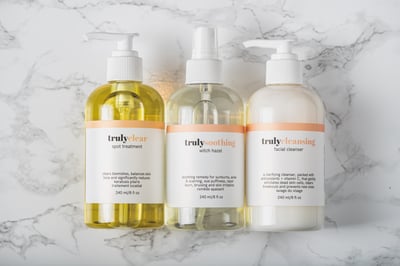
Get the clean look that’s trending by going minimal. Think lots of neutral colours like white, pale greys, and the like. It also means limited text and decorative elements. Just check out Truly’s elegant and simple labels pictured above. A great example of a well-executed minimalist label.
Use peel-off technology

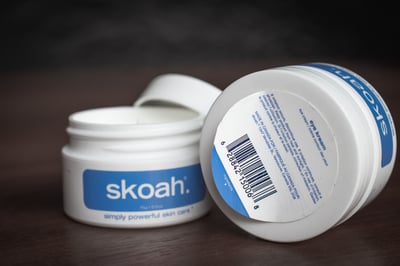
Struggling to include all of the necessary elements outlined above on your cosmetic label? Try using peel-off labels. This provides additional space and conveniently hides any informational text that might clutter the design. Skoah used this cool technology with one of their face creams, as shown here!
Try embellishments

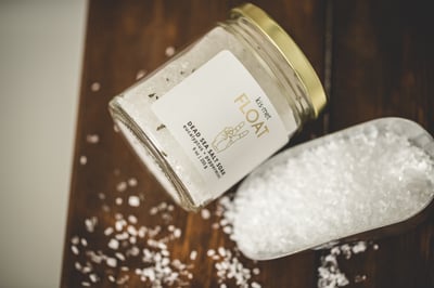
One way to level up your labels and jouge up the design is by using embellishments. For example, adding a high build element to your label provides a more tactile experience, or maybe you love the shine and want to try foil stamping for a more premium feel. There are plenty of options to play with, and one of our favourites is Kismet's use of foil with their dead sea salt soak shown above.
Now you’ve got the basics and more! Just a friendly reminder that this is supposed to serve as a helpful resource, but it is always a good idea to run it past legal. Now, fly free with your new cosmetic label knowledge.


Follow Us